Welcome! I’m Jim Pan, a data analyst with expertise in data analysis, AI-driven image generation, geographic information systems (GIS), and Quarto web design. Over the past several years, I have developed strong skills in translating complex data into actionable insights, working with advanced AI tools to create innovative solutions. I am actively seeking opportunities to bring my analytical skills and creativity to a dynamic team.
Learn more about me in the About Me section or download my CV.
Switch to dark mode for a more focused reading experience.
2 What I Offer
2.1Data Analysis Expertise:
With extensive experience in research-based analysis and Labs01, Labs02, I have developed advanced skills in interpreting complex datasets and building models, particularly for academic and report-driven projects. Check out my Interactive Shiny App for an example of my data analysis work.
2.2AI Art Generation:
I specialize in using ComfyUI for AI-driven image and video generation, creating visually compelling and technically innovative outputs for a variety of creative and research-driven projects. My expertise extends to AI product rendering and poster generation, where I combine advanced AI techniques with creative design to produce high-quality visual assets for marketing, advertising, and academic purposes.
AI Art Generation Example
2.3Geographic Information Systems (GIS):
I am proficient in ArcGIS, applying GIS tools to produce detailed maps and analyze spatial data. This work complements my analytical projects by providing location-based insights and visualizing geographic patterns.
2.4Project Success:
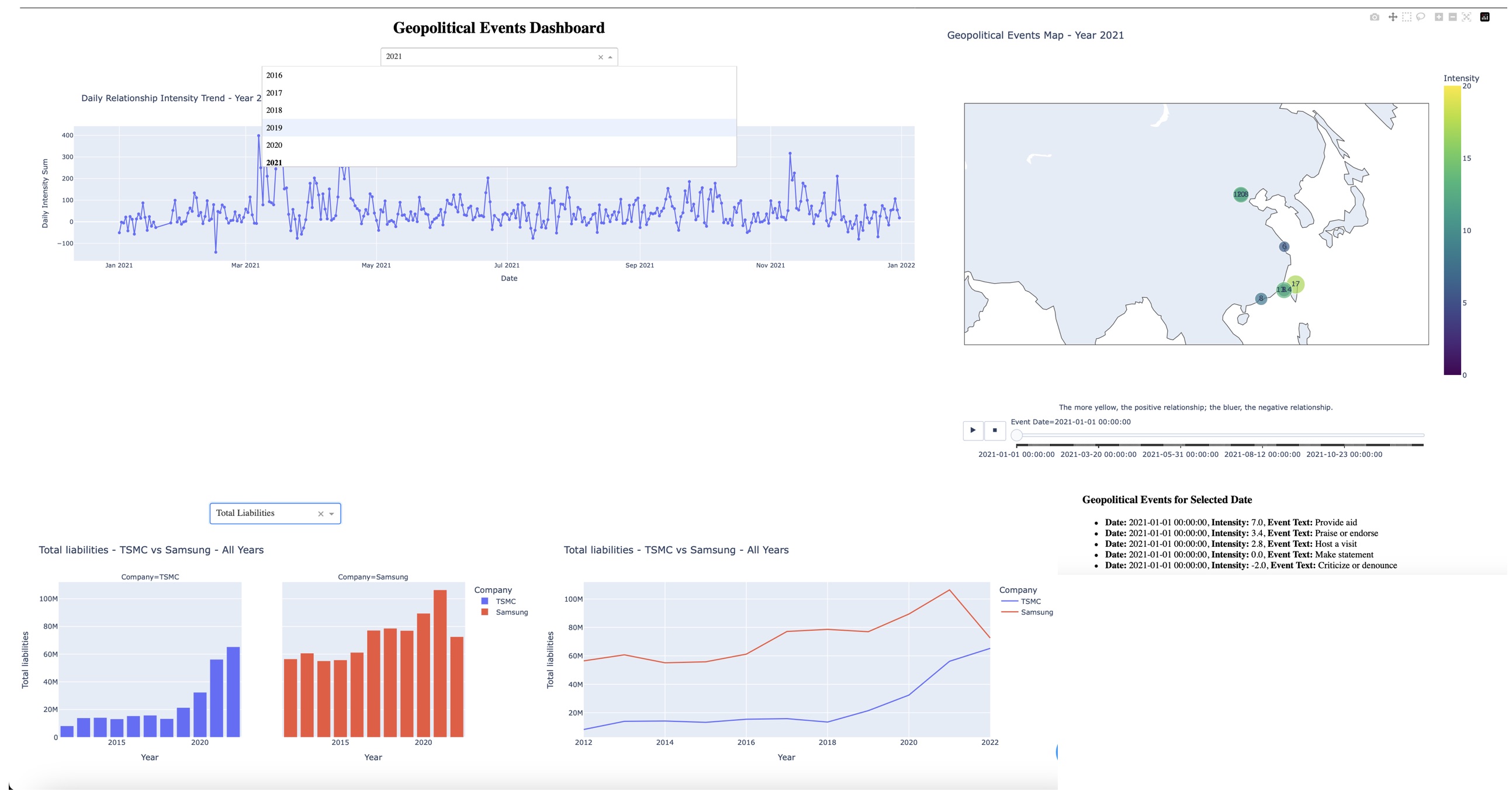
I developed a comprehensive dashboard using Python, showcased in my Geopolitical and Financial Analysis Dashboard based on data from ICEWS. This dashboard features an analysis of monthly positive and negative geopolitical events in East Asia, represented through a time series chart. Additionally, it includes a financial comparison chart between TSMC and Samsung, highlighting key differences in their performance over time. This project provided a detailed understanding of regional geopolitical trends and visualized corporate performance disparities, demonstrating my ability to handle large datasets, create impactful visualizations, and deliver actionable insights.
The navigation bar at the top will guide you through the site. Feel free to explore and discover my ongoing projects and experiments.
3 Interactive Data Analysis Example
3.1 Interactive Shiny App
This project compares chronic disease prescriptions in major medical centers across Taiwan, utilizing a centralized database to manage data more effectively. The interactive Shiny app allows users to visualize trends in prescription rates, hospital occupancy, and other key metrics related to chronic disease management.
Note: The generated interactive visualizations may not display at their optimal size or proportion on mobile devices. For the best experience, please view on a tablet or desktop.
The app integrates data sources from Taiwan’s Ministry of Health and Welfare, showing how data analysis can support decision-making in healthcare. It includes features like dynamic filtering, visualizations of prescription data by disease type, and a toggleable sidebar for a customized view. The backend is built using SQL for data organization, R for statistical analysis, and Shiny for the interactive frontend.
For more information and tutorials on Shiny, visit the Shiny Gallery.
3.2 Bubble Plot Example
This bubble plot displays 30 points with distinct size variations and clear labels. The bubble size reflects the size variable, while colors are mapped to the combination of the x and y values using the Viridis color scale. Labels are placed above each bubble for better readability, making it easier to observe the relationship between the x, y, and size variables.
Code
library(plotly)# Generate dataset.seed(123)data <-data.frame(x =rnorm(30, mean =50, sd =10), y =rnorm(30, mean =100, sd =20),size =abs(rnorm(30, mean =50, sd =25)), label =paste("Point", 1:30) )# Create a bubble plot with hover and click interactionp <-plot_ly( data, x =~x, y =~y, type ='scatter', mode ='markers+text', marker =list(size =~size, color =~x+y, colorscale ='Viridis', showscale =TRUE ),text =~label, textposition ="top center", hoverinfo ="text+x+y", # Display label and coordinates on hoverhovertext =~paste("Label:", label, "<br> X:", round(x, 2), "<br> Y:", round(y, 2), "<br> Size:", round(size, 2))) %>%layout(title ="Interactive Bubble Plot",xaxis =list(title ="X Axis Label"),yaxis =list(title ="Y Axis Label"),showlegend =FALSE ) %>%event_register("plotly_click") # Register click event# Display the plotp
4 AI Projects Showcase
4.1 GenAI Prompt Assistant (Capstone Project)
In my most recent Kaggle Capstone Project (2025Q1), I built a Prompt Rewriting Assistant to help beginners and non-technical users ask better questions when interacting with large language models (LLMs) like Gemini or ChatGPT.
This assistant uses:
• 🧪 Few-shot prompting to show examples of good prompts
• 🔁 Retrieval-Augmented Generation (RAG) to recommend similar prompts based on semantic similarity
• 🔧 Function Calling & LangGraph to trigger tools automatically based on user intent
• 📦 ChromaDB to store and retrieve high-quality prompt examples
The final result is an interactive agent that rewrites vague or broad user inputs into structured JSON prompts with suggested placeholders—making LLMs more usable, especially for beginners.
This project demonstrates the construction of a Fully Connected Neural Network (FCNN) using PyTorch to classify MNIST handwritten digits. It includes complete steps such as data preprocessing, model architecture (784 → 256 → 512 → 344 → 10), training-validation loop, GPU acceleration using Apple Silicon (MPS), and model saving/loading.
First, discuss with STAKEHOLDERS to confirm their business needs and analysis objectives. Ensure that the data you aim to collect is directly related to these goals, and gain access to the database. At this stage, also consider DATA PRIVACY and COMPLIANCE to ensure that the subsequent analysis is lawful.
5.2DATA COLLECTION
Based on the analysis needs, use appropriate tools (such as SQL, APIs, or WEB SCRAPING) to collect data and download it locally for processing. During collection, pay attention to DATA INTEGRITY and ACCURACY to avoid collecting excessive irrelevant data or missing key information.
5.3DATA CLEANING
Use Python’s pandas, numpy, or R’s dplyr, tidyverse tools to clean the data. This step includes filling in MISSING VALUES, removing OUTLIERS, handling DUPLICATE DATA, and standardizing data formats to ensure the quality of the data meets analysis standards.
5.4DATA ANALYSIS
Based on the analysis objectives, use Python or R to perform the data analysis. Common methods include CLASSIFICATION, REGRESSION, CLUSTERING, and TIME SERIES ANALYSIS. Depending on the need, choose suitable STATISTICAL or MACHINE LEARNING MODELS, and use visualization tools such as matplotlib, seaborn (Python), or ggplot2 (R) to visualize the data and discover key trends and patterns.
5.5PRESENTATION OF RESULTS
Present the analysis results in a clear and understandable way to STAKEHOLDERS. You can use tools like TABLEAU or POWER BI to create interactive dashboards or generate charts using Python and R visualization tools such as ggplot2 and plotly. Additionally, write REPORTS summarizing the results, clearly explaining the BUSINESS OR RESEARCH IMPLICATIONS, ensuring that stakeholders can understand and take appropriate action.
根據分析目標,使用Python或R進行資料分析,常見的分析方法包括分類(CLASSIFICATION)、回歸(REGRESSION)、聚類(CLUSTERING)、時間序列分析(TIME SERIES ANALYSIS)等。根據需求,選擇適合的統計或機器學習模型進行分析,並使用圖表工具如matplotlib、seaborn(Python),或ggplot2(R)來進行資料視覺化,幫助發現資料中的關鍵趨勢和模式。