Jim Pan’s Knowledge Hub
1 Welcome to Jim Pan’s Knowledge Hub

Welcome! I’m Jim Pan, a data analyst with expertise in data analysis, AI-driven image generation, geographic information systems (GIS), and Quarto web design. Over the past several years, I have developed strong skills in translating complex data into actionable insights, working with advanced AI tools to create innovative solutions. I am actively seeking opportunities to bring my analytical skills and creativity to a dynamic team.
Learn more about me in the About Me section or download my CV.
For projects and code, visit my GitHub.
Switch to dark mode for a more focused reading experience.
2 What I Offer
2.1 Data Analysis Expertise:
With extensive experience in research-based analysis and Labs01, Labs02, I have developed advanced skills in interpreting complex datasets and building models, particularly for academic and report-driven projects. Check out my Interactive Shiny App for an example of my data analysis work.
2.2 AI Art Generation:
I specialize in using ComfyUI for AI-driven image and video generation, creating visually compelling and technically innovative outputs for a variety of creative and research-driven projects. My expertise extends to AI product rendering and poster generation, where I combine advanced AI techniques with creative design to produce high-quality visual assets for marketing, advertising, and academic purposes.

2.3 Geographic Information Systems (GIS):
I am proficient in ArcGIS, applying GIS tools to produce detailed maps and analyze spatial data. This work complements my analytical projects by providing location-based insights and visualizing geographic patterns.
2.4 Project Success:
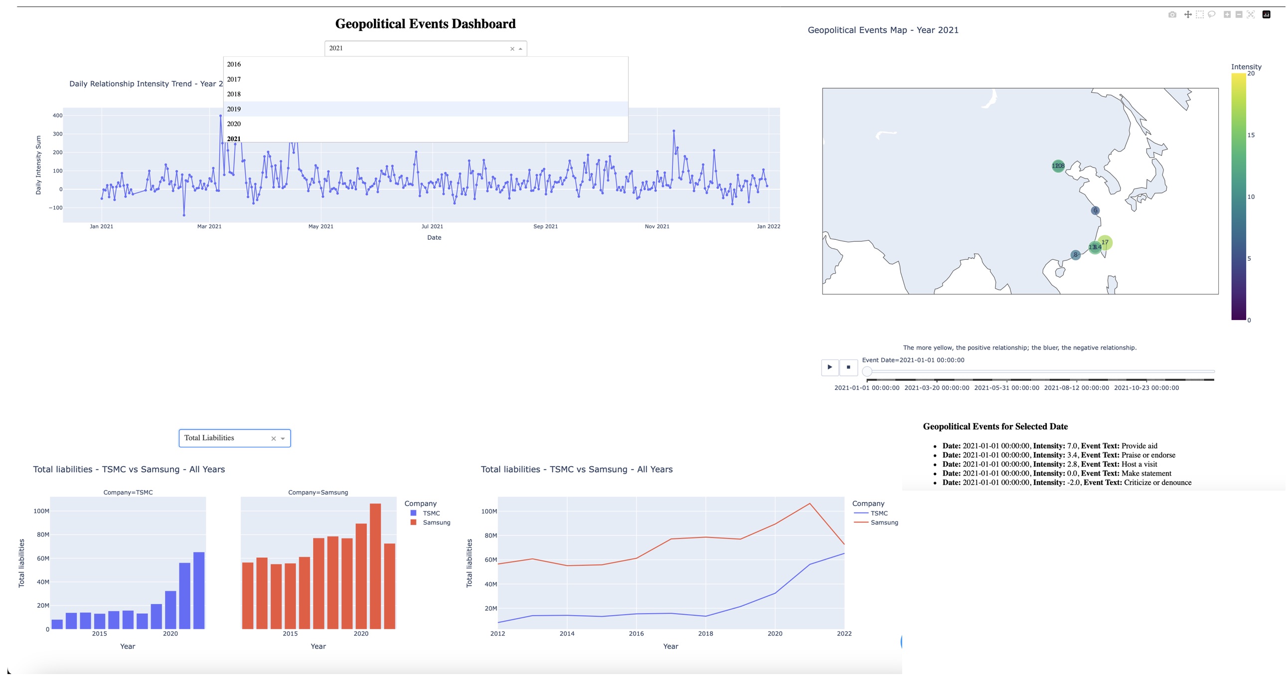
I developed a comprehensive dashboard using Python, showcased in my Geopolitical and Financial Analysis Dashboard based on data from ICEWS. This dashboard features an analysis of monthly positive and negative geopolitical events in East Asia, represented through a time series chart. Additionally, it includes a financial comparison chart between TSMC and Samsung, highlighting key differences in their performance over time. This project provided a detailed understanding of regional geopolitical trends and visualized corporate performance disparities, demonstrating my ability to handle large datasets, create impactful visualizations, and deliver actionable insights.
Explore my work in areas like ArcGIS, ComfyUI, and my Course Assignments 01 02.
The navigation bar at the top will guide you through the site. Feel free to explore and discover my ongoing projects and experiments.
3 Power BI Healthcare Dashboard Reconstruction
This project demonstrates my hands-on experience in rebuilding legacy Tableau reports into Power BI dashboards for healthcare data analysis. The work focused on report logic reconstruction, data model design, DAX measure creation, metric validation, and dashboard usability improvement.
Key tasks included:
- Reconstructing Tableau-based reporting logic in Power BI
- Designing data models and DAX measures for healthcare operational indicators
- Validating metric consistency between legacy Tableau outputs and new Power BI dashboards
- Handling deduplication, aggregation differences, date filtering, and reporting logic alignment
- Improving dashboard layout and usability for multi-dimensional analysis
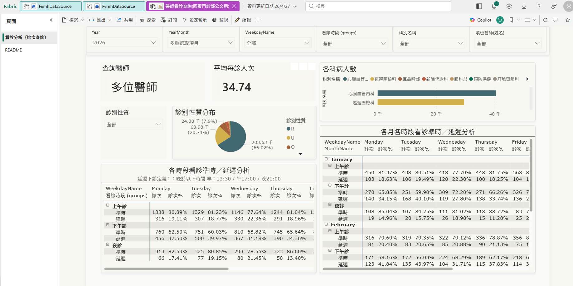
3.1 Physician Outpatient Session Analysis Dashboard
This dashboard supports physician-level outpatient session review by analyzing visit volume and on-time / delayed clinic completion patterns across months, weekdays, departments, and clinic time periods.
It was built to help operational users compare session-level patient volume, identify delay patterns, and support outpatient schedule or capacity adjustment discussions.
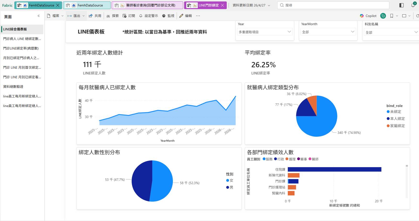
3.2 LINE Binding Analysis Dashboard
The dashboard below analyzes LINE binding status and binding rate trends among outpatient visitors. It includes monthly binding trends, binding type distribution, gender distribution, and staff or department-level binding performance indicators.
4 AI Projects Showcase
4.1 GenAI Prompt Assistant (Capstone Project)
In my most recent Kaggle Capstone Project (2025Q1), I built a Prompt Rewriting Assistant to help beginners and non-technical users ask better questions when interacting with large language models (LLMs) like Gemini or ChatGPT.
This assistant uses:
• Few-shot prompting to show examples of good prompts
• Retrieval-Augmented Generation (RAG) to recommend similar prompts based on semantic similarity
• Function Calling & LangGraph to trigger tools automatically based on user intent
• ChromaDB to store and retrieve high-quality prompt examples
The final result is an interactive agent that rewrites vague or broad user inputs into structured JSON prompts with suggested placeholders—making LLMs more usable, especially for beginners.
➡️ Read the Full Walkthrough Blogpost
➡️ View the Kaggle Notebook
4.2 Handwritten Digit Classifier with PyTorch
This project demonstrates the construction of a Fully Connected Neural Network (FCNN) using PyTorch to classify MNIST handwritten digits. It includes complete steps such as data preprocessing, model architecture (784 → 256 → 512 → 344 → 10), training-validation loop, GPU acceleration using Apple Silicon (MPS), and model saving/loading.
5 Interactive Data Analysis Example
5.1 Interactive Shiny App
This project compares chronic disease prescriptions in major medical centers across Taiwan, utilizing a centralized database to manage data more effectively. The interactive Shiny app allows users to visualize trends in prescription rates, hospital occupancy, and other key metrics related to chronic disease management.
Note: The generated interactive visualizations may not display at their optimal size or proportion on mobile devices. For the best experience, please view on a tablet or desktop.
The app integrates data sources from Taiwan’s Ministry of Health and Welfare, showing how data analysis can support decision-making in healthcare. It includes features like dynamic filtering, visualizations of prescription data by disease type, and a toggleable sidebar for a customized view. The backend is built using SQL for data organization, R for statistical analysis, and Shiny for the interactive frontend.
For more information and tutorials on Shiny, visit the Shiny Gallery.
6 FIVE STEPS OF DATA ANALYSIS
6.1 DEFINE THE TOPIC
First, discuss with STAKEHOLDERS to confirm their business needs and analysis objectives. Ensure that the data you aim to collect is directly related to these goals, and gain access to the database. At this stage, also consider DATA PRIVACY and COMPLIANCE to ensure that the subsequent analysis is lawful.
6.2 DATA COLLECTION
Based on the analysis needs, use appropriate tools (such as SQL, APIs, or WEB SCRAPING) to collect data and download it locally for processing. During collection, pay attention to DATA INTEGRITY and ACCURACY to avoid collecting excessive irrelevant data or missing key information.
6.3 DATA CLEANING
Use Python’s pandas, numpy, or R’s dplyr, tidyverse tools to clean the data. This step includes filling in MISSING VALUES, removing OUTLIERS, handling DUPLICATE DATA, and standardizing data formats to ensure the quality of the data meets analysis standards.
6.4 DATA ANALYSIS
Based on the analysis objectives, use Python or R to perform the data analysis. Common methods include CLASSIFICATION, REGRESSION, CLUSTERING, and TIME SERIES ANALYSIS. Depending on the need, choose suitable STATISTICAL or MACHINE LEARNING MODELS, and use visualization tools such as matplotlib, seaborn (Python), or ggplot2 (R) to visualize the data and discover key trends and patterns.
6.5 PRESENTATION OF RESULTS
Present the analysis results in a clear and understandable way to STAKEHOLDERS. You can use tools like TABLEAU or POWER BI to create interactive dashboards or generate charts using Python and R visualization tools such as ggplot2 and plotly. Additionally, write REPORTS summarizing the results, clearly explaining the BUSINESS OR RESEARCH IMPLICATIONS, ensuring that stakeholders can understand and take appropriate action.
7 資料分析五個步驟
7.1 明確主題
首先與STAKEHOLDER進行討論,確認他們的業務需求和分析目標。確保你所要抓取的資料與這些目標具有直接的關聯性,並獲得資料庫的存取權限。在這個階段,也需要考慮資料的隱私和合規性,以保證後續分析合法合規。
7.2 資料收集
根據分析需求,使用合適的工具(例如SQL、API或網頁爬蟲等)來抓取資料,並下載到本地進行處理。在收集過程中,注意確保資料的完整性和準確性,避免收集到過多無關資料或遺漏關鍵資料。
7.3 資料清理
使用Python的pandas、numpy,或R的dplyr、tidyverse等工具來清理資料。這一步包括填補缺失值、去除異常值、處理重複資料、統一資料格式等,確保資料質量達到分析的標準。
7.4 資料分析
根據分析目標,使用Python或R進行資料分析,常見的分析方法包括分類(CLASSIFICATION)、回歸(REGRESSION)、聚類(CLUSTERING)、時間序列分析(TIME SERIES ANALYSIS)等。根據需求,選擇適合的統計或機器學習模型進行分析,並使用圖表工具如matplotlib、seaborn(Python),或ggplot2(R)來進行資料視覺化,幫助發現資料中的關鍵趨勢和模式。
7.5 結果呈現
將分析結果以易於理解的方式呈現給STAKEHOLDER。可以使用TABLEAU、POWER BI等工具製作交互式儀表板,或者使用Python、R中的資料視覺化工具(如ggplot2、plotly)生成圖表。此外,撰寫報告總結分析結果,並清晰地解釋這些結果對業務或研究的影響,確保stakeholder能夠理解並採取相應的行動。
8 Contact
- Email: jimpan0612@gmail.com
- GitHub: Jimpan0612
- LinkedIn: Chun-Yen Pan
- Personal Website: MyWebsite
9 Update Log
9.1 September14, 2024
- Updated 6302_6356Labs.
9.2 September 9, 2024
- Added Shinyapps.io example to Homepage.
9.3 September 8, 2024
- Updated Homepage.
- Added Sitemap.
- Updated Product rendering examples Lab.
9.4 September 7, 2024
- Updated about me.
- Added Product rendering examples and poster generation examples to AI Art & Animation section.
9.5 September 5, 2024
- Added GA4(Google Analytics 4).
- Added vid2vid Lab to AI Art & Animation section.
9.6 September 4, 2024
- Updated about me.
- Updated AI Art & Animation section.
9.7 September 3, 2024
- Added AI Art & Animation section.
- Added Lab01~10 to ArcGIS section.
- Updated sidebar in ArcGIS section.
9.8 September 2, 2024
- Added a new sidebar to the website.
- Improved the color scheme for better readability.
- Updated the footer with new social media links.
9.9 September 1, 2024
- Updated CV and about me.
- Added logo in nav bar.
9.10 August 30, 2024
- Added back to top function.
- Integrated GitHub and LinkedIn icons in the navigation bar.
- Added dark mode.
9.11 August 25, 2024
- Added Updated Log.
- Updated GitHub SSH URL repo.
- Added section for ArcGIS labs.